Hello! I took another photo! This time it’s rather dark, it’s a forest, at night, with an eerie light coming at the end of the path, through the fog. It has taught me three things:
- You don’t need many sophisticated adjustments to achieve most of the effects you will want to achieve. A few simple adjustments here and there can go a long way.
- I used to think that, when people said “I wanted to convey this specific feeling”, or “I wanted to achieve this objective with this piece”, it was bullshit. I see now that, oftentimes, you have a specific idea in mind and work towards it, as I did with this photo for the first time, for me.
- I shouldn’t dismiss mobile phones so easily. I didn’t have a camera with me at the time, and it was either “take the photo with the phone” or “don’t take it at all”, and I went with the former. It’s probably my favorite photo of mine so far, so you definitely won’t hear me dissing mobiles again. They can be very useful under specific circumstances (mostly when there’s a lot of light and you won’t need a large print).
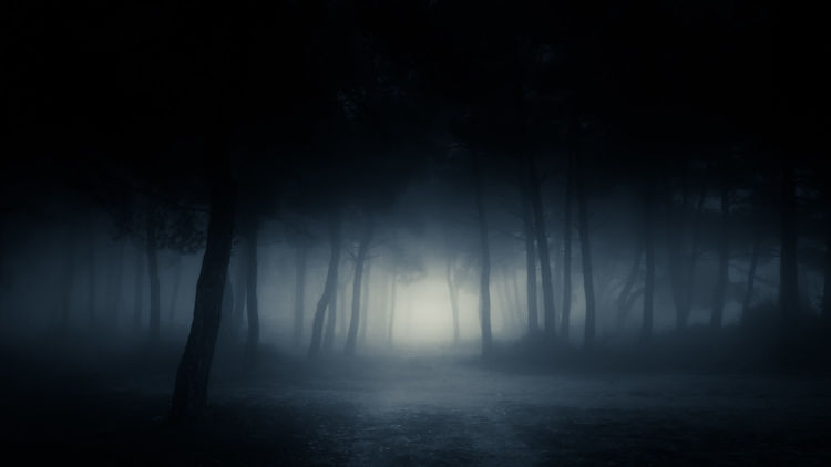
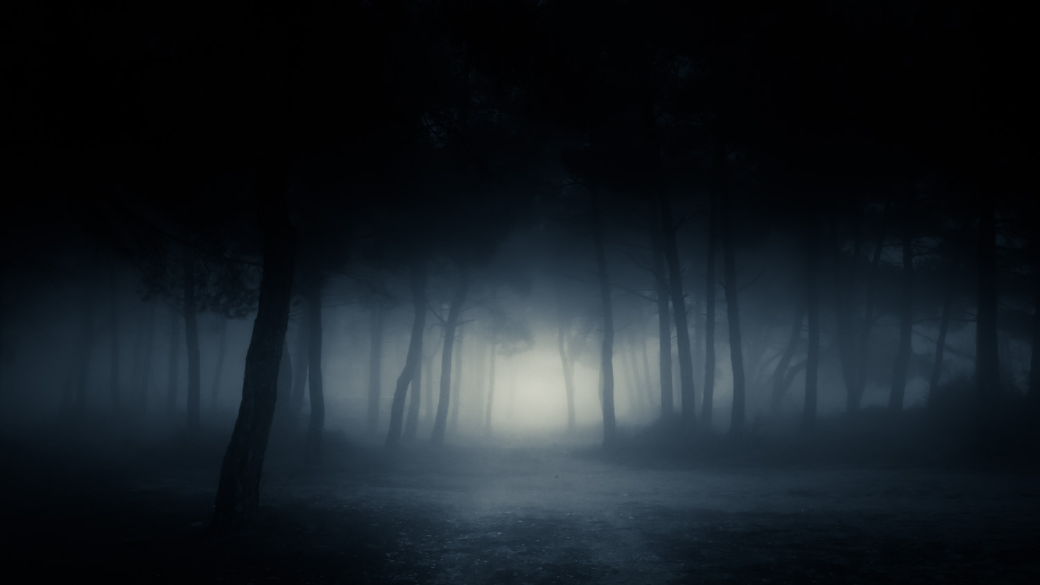
In this post, I am going to show you the process from the initial, unedited copy, all the way to the final edit. Here’s the latter:
Let’s dive into the actual process, to see how it was created.
From start to finish
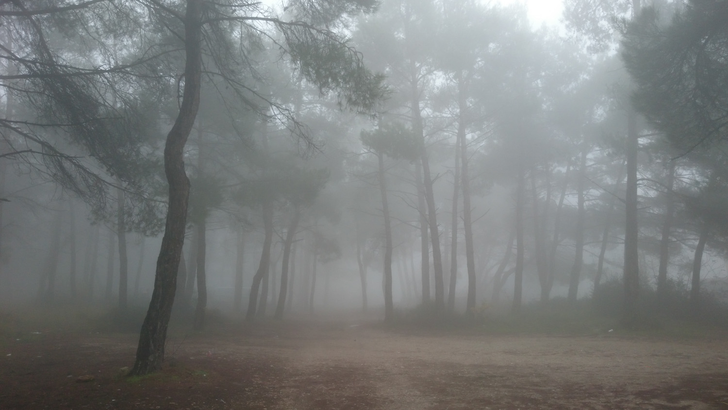
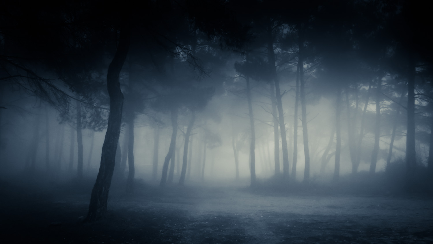
This is the original photo, straight off my mobile phone. You can see that it looks rather good already:
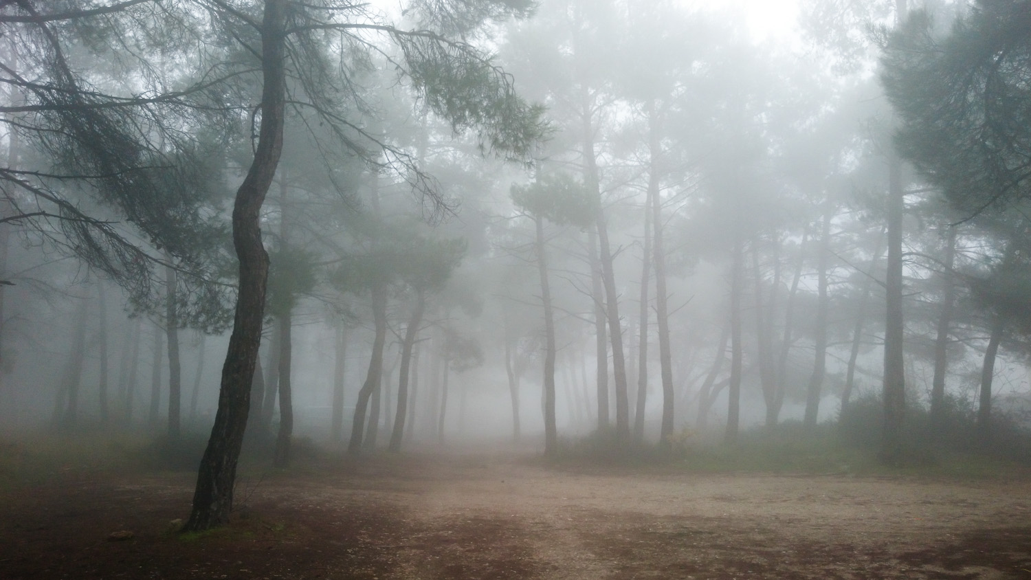
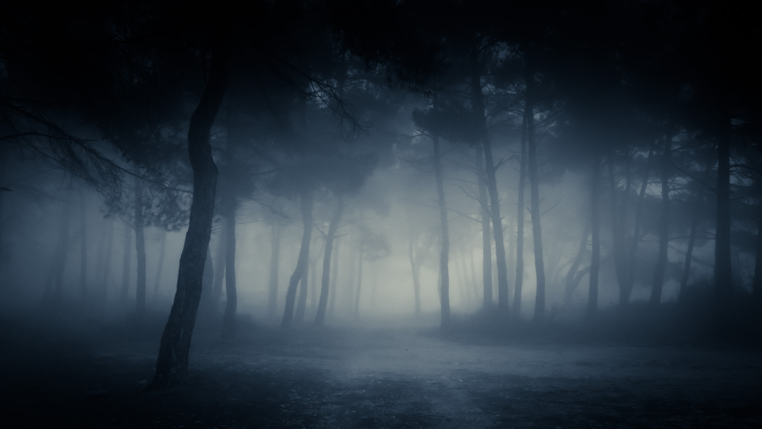
We’ll start by tweaking the levels just a bit:

The ground is really dirty (this forest is outside a hospital), let’s clean it up:
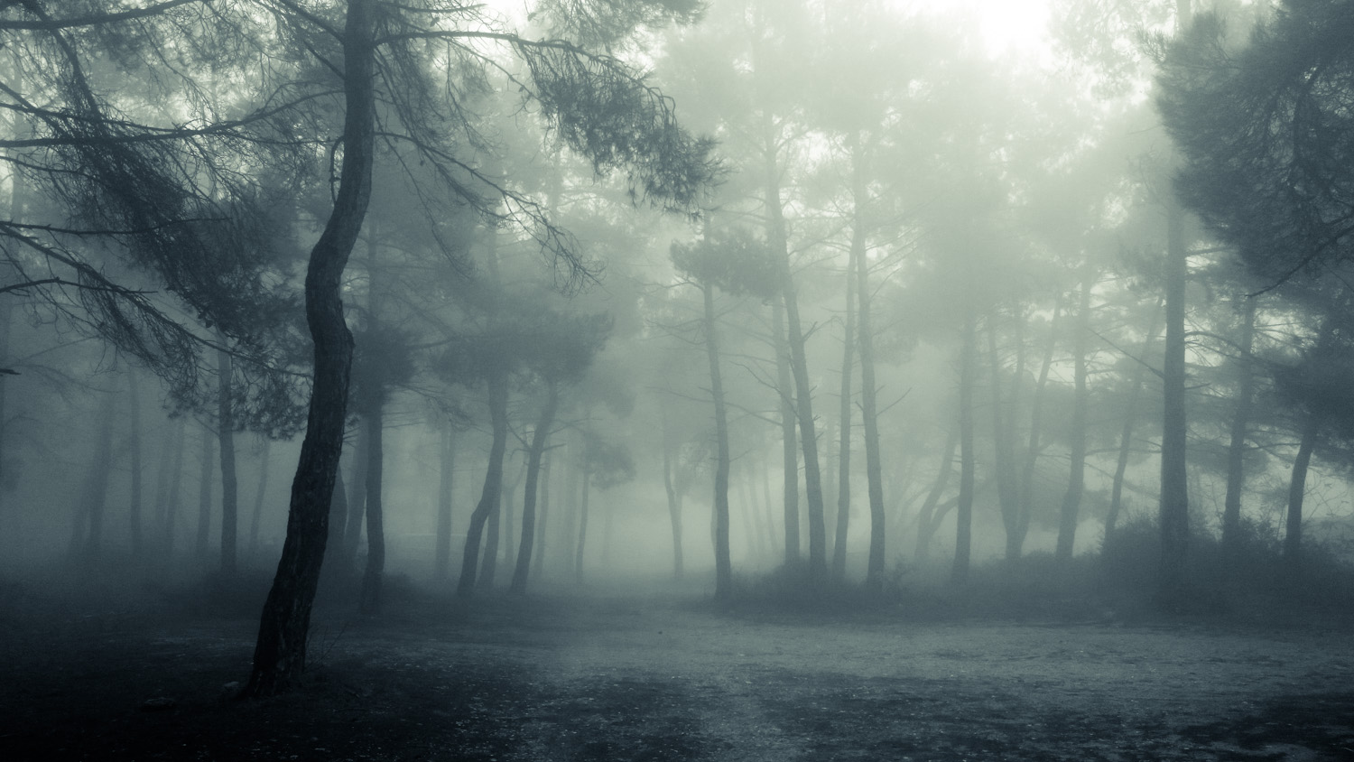
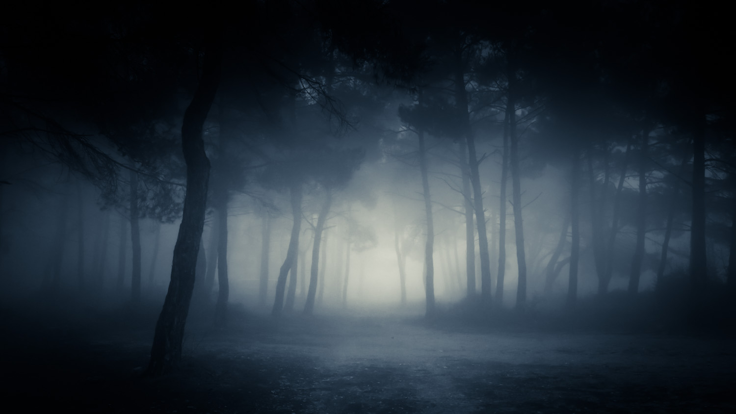
Messing around with duotone, it starts to look like a forest at night. I selected a color that mimics the night palette, not too black, but not too blue either. I made the highlight slightly yellow/orange to give a sense of hope:
The sky looks too bright, though. It’s clearly still day out. I wanted to create a more gloomy environment in the forest, as if the canopy is thick and the night sky is dark. A gradient does the trick very well:

I’d like the path to be centered exactly, so let’s crop the right side a bit:

The highlight colors are too green, a bluish tint looks better:
The right side is too bright and draws the eye too much. I wanted the eye to be drawn directly ahead, at the end of the path, so a gradient that darkens the right side is exactly what’s needed:
Same for the left side now, but not as dark (the left side is dark already):

I wanted to underscore the hope that the light at the end of the path offers, and to draw the eye to it immediately, so I made the center a bit brighter:
The tops of the trees are still too bright, there’s lots of light shining through. More gradient!
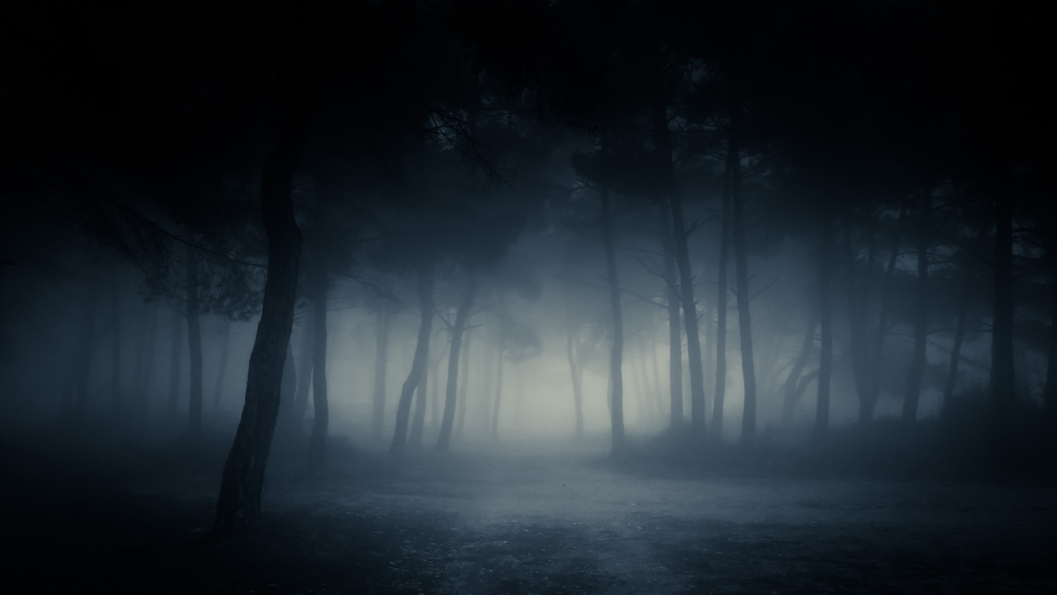
Some vignetting, some final adjustments, and our photograph finally conveys the emotion we’d like it to:
If you have any feedback or questions, leave a comment below or Tweet to me. I hope you enjoyed the post more than I enjoyed writing it, which is “moderately”. Kisses!